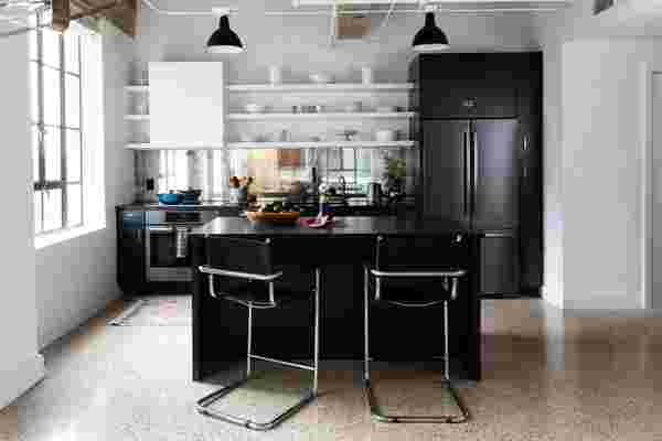
“It’s really nice when a client is willing to try new things and take risks,” Allison Crawford says. At the time, she’d never seen a mirrored backsplash before, but she went for it.
Steeped in Art Deco details like a marbled lobby, etched-glass paneling, and steel-framed windows, the Brown Building, a National Historic Landmark in downtown Austin, Texas, and the former home of the Lyndon B. Johnson family holding company, was turned into condos in the late 1990s. And one couple, recent New York transplants, fell for the architectural details but realized that their 1930s loft would need some major modern updates .
With the help of interior designer and Hotelette founder Allison Crawford and builder Diana Skellenger , the homeowners took their cramped, dated kitchen and turned it into a more spacious, eclectic, and light-filled space.
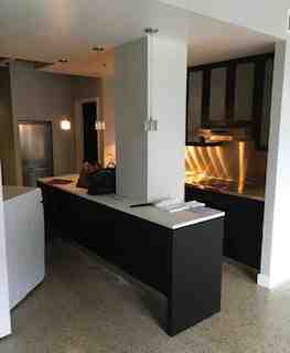
The original kitchen layout was far from usable.
Location: Downtown Austin
The before: The original peach-hued terrazzo flooring was the only saving grace. “It felt like a cave,” Allison says. “They needed more storage and more light for when they were cooking, plus the original layout wasn’t a practical use of space.”
The inspiration: They had gotten a lot of items, including a myriad of cool art from the Brooklyn Flea as well as from their travels to South America, and wanted to incorporate those pieces. “They hired me to marry the Art Deco Industrial feel with more modern elements for a cohesive, edited look,” Allison says. “It was important to stay true to the architecture [as well].”
Square footage: 126 square feet (originally 50 square feet)
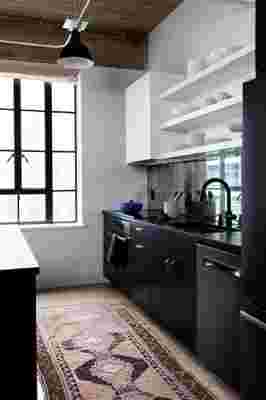
The easiest way to bring more light into a space is mirrors. And though the industrial windows were stellar, the designer added the backsplash to brighten up the small kitchen.
The lower cupboards and the built-ins around the refrigerator are painted in Farrow & Ball’s Railings —a black with blue undertones. The hardware is an old and new mix, all with a brass finish.
Main Ingredients:
Backsplash: Antique mirror from Atlanta Mirror Marvel
Rug: Vintage Turkish rug from Etsy
Hardware: Mixture of old and new in antique brass and matte black finishes from Etsy
Paint color: Farrow & Ball Railings on the lower cabinetry. Benjamin Moore SuperWhite on the exposed shelving and hood.
Most insane splurge: “The backsplash, for sure,” Allison says. “But the charcoal matte black fixtures are more expensive than stainless, since it’s a newer product and not that many suppliers make fixtures in that finish yet.”
Sneakiest save: The exposed shelving . “You save so much money on cabinetry when you go with exposed shelving,” she says. “Also, we also didn’t touch the original floors. Refinishing them would’ve been super expensive so we embraced the imperfections. Furthermore, we kept the original black ceiling-light locations. Moving the electric would’ve been tricky.”
The best part: “I love the contrast between the vintage brass hardware and the paint, but the countertops are my favorite. They are honed-leather black granite, which is totally underutilized—it's one of the cheaper countertop options, is easy to clean, and doesn’t show dirt.”
What I'd never do again: “Everything went as planned,” Allison says. “There’s nothing I can think of I would’ve done differently.”
