Sony announced its new 4K and wedge-shaped TVs at CES earlier this month, but until now we hadn't had the chance to see what was new on the software side of things. That changed earlier this week when Sony invited us to its UK HQ to see the entire range, including the updated SEN Smart TV interface.
Last year's models were more evolution than revolution, showing promise in the new SEN interface but keeping remnants of the old Cross Media Bar (XMB) design that first arrived with the PlayStation 3 back in 2006. Sony has completely changed its approach for 2014 with a brand-new look, which uses smaller icons that don't hog so much screen space, a grid-based layout which can fit many more items onscreen than vertically scrolling XMB lists and a video overlay that doesn't steal focus from the currently playing channel or input.
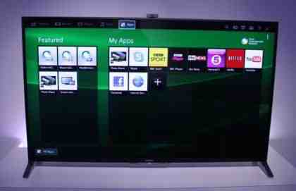
The Apps page fits far more icons onscreen now
Each TV should now start up in around two seconds, down from almost 10 in the 2013 range. The pre-production model we were shown switched on in four, but it still took around 10 more seconds before we could jump into the smart TV features. Using the angular One-Flick remote control, which has a large touchpad to navigate the new UI, you can bring up a floating menu that lets you scroll through TV listings, catch-up programmes and YouTube videos without blocking the entire screen - a real improvement over the focus-stealing Smart TV systems of previous years.
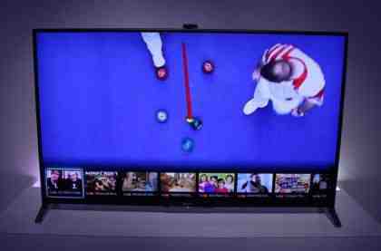
The One-Flick menu is delightfully unobtrusive
The new TV Guide is icon-based, downloading images and listings from the internet to present popular and upcoming shows on the front page to save you diving into the more familiar text-based guide. You can still queue up recordings if you have a USB flash drive attached, or schedule reminders for upcoming shows.
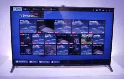
The more detailed TV guide should show you just the programmes you want to watch
The traditional Apps screen is still available if you prefer to see everything onscreen at once. It lets you access content from connected web services, as well as DLNA media servers and USB flash drives, all from the same page - meaning no more jumping between menus to get from one app to another. The demo unit we saw only had Demand 5, BBC iPlayer, Netflix and YouTube installed, but Sony has plenty of time to organise content deals before the first 2014 TVs go on general sale.
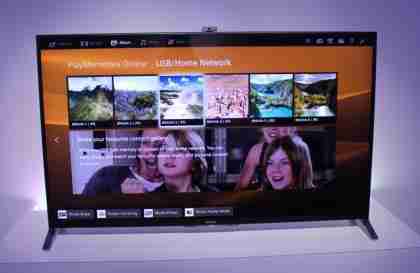
Pictures can be viewed from networked PCs or USB flash drives, as well as from Sony's PlayMemories app
Tabs at the top of the screen let you dive into dedicated Music, Movies and Pictures pages, which use Sony's own Music Unlimited, Video Unlimited and Play Memories services for subscription-based music streaming, film rentals and photo uploads respectively. Sony also has an exclusive deal with Vevo to deliver music videos to its 2014 TVs.
You won't get Vevo content on any other smart TV
We have yet to find a TV that handles social networking in a way we could actually see ourselves using on a regular basis, but Sony may have done it with Social View. It lets you set up a Twitter keyword search for the current programme, then have relevant tweets scroll along the bottom of the screen as they are posted. If you frequently tweet along with your favourite TV show, this could be a handy way to see what the rest of the nation thinks about it.
Social View seems perfect for anyone addicted to Twitter
Overall, we feel Sony's new look Smart TV system is a major improvement over the outgoing range. The redesign feels like a real step forward, unlike the simpler tweaks made to Samsung's Smart Hub, and although it isn't quite as dramatic as the Android-powered Philips sets or LG's WebOS operating system , we can't wait to give it a more in-depth test.
The new Smart TV interface will be appearing on all Sony TVs from the W7 and up when they arrive in the UK later this year. We'll be sure to go into more details when we get the first review samples into the office.


