Lately, new designs for the kitchen look more and more like old designs for the kitchen. There’s a certain style of British kitchen — vintage-style appliances, Shaker-style cabinets, a bit austere but with very traditional accents — that’s becoming very popular. Looking at these kitchens, I am struck by the fact that they look remarkably similar to some of the 1920s kitchens I came across while researching this series about the history of kitchen design . Everything old is new again — and in this case, what’s particularly old is particularly new.
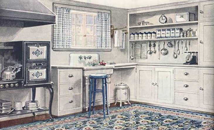
Looking at this 1921 kitchen from Antique Home Style , the similarities to the modern kitchens below are almost eerie. The style of the cabinet doors is the same, and in this kitchen and many others below we see tall upper cabinets meeting deeper lower cabinets to form a sort of ledge. Even the smaller details ring true, like the lack of a toe kick. And although the 1920s legged gas stove is a thing of the past, these new old kitchens treat the range in a similar way. In the past, a large range hood was a necessity: now, it’s a statement. Eliminating the upper cabinets over the stove turns the range hood into a sculptural feature, and makes your (probably quite pricey) vintage-style stove the focal point of the kitchen.
One thing these kitchens don’t have in common with the average 1920s kitchen is the color palette. By the end of the decade, bright colors were actually quite popular for the kitchen, as seen in this 1929 kitchen from Antique Home Style . The English kitchens of today have a much more somber palette, reflecting the more muted colors that are currently popular in every part of the home. Another not quite similarity is the sink. The farmhouse style, although conspicuously old-fashioned, is still a far cry from the freestanding sinks of yesteryear. Perhaps those will make a comeback, too?
The glass cabinets in this kitchen from deVOL , via Desire to Inspire , would be perfectly at home in a kitchen from 100 years ago. (These cabinets do have a toe kick, which, although it modernizes the aesthetic a bit, is still a nice ergonomic detail.)
The island worktable and rather massive AGA range give this kitchen by Plain English a strong vintage vibe. Notice how the cabinetry surrounding the sink replicates the look of the freestanding cabinets, or “hoosiers”, of the past.
The island work table and the treatment of the range in this kitchen from Plain English are very old-fashioned, but the rich hunter green of walls and cabinets is distinctly modern. (The contrasting green on the island is a nice touch.)
In a kitchen from deVOL , built-in cabinets replicate the old-fashioned, country-kitchen look of freestanding cabinetry.
Here’s another kitchen by deVOL that skews a bit more modern, but still has classic roots. Note the absence of a toe tick.
Although we tend to think of it as a new development, open shelving features prominently in many kitchens of the past. In fact, some kitchen design guides recommended it because it made supplies easier to reach. In this kitchen by Plain English , matching food storage jars give the open shelving a neat feel.
You could almost imagine this kitchen from Plain English in a home from 100 years ago (although, as I’ve mentioned above, the color is much more somber and the sink much less prominent).
This kitchen from Light Locations exudes vintage charm, but also makes use of some modern appliances.
This kitchen by deVOL is a bit smaller than some of the others, but no less charming. A full-height wall of cabinets on the left sacrifices a bit of counter space, but assures that storage will never be in short supply.
