The history of design is littered with defunct trends — things that were popular for a brief span of time and are now reviled, or just forgotten. Some of them probably don’t deserve a revival (I’m looking at you, shag carpeting), but others are worth a second look. One thing that falls squarely into the second camp? The mirrored backsplash.
If I’m not mistaken, the first time this trend came around was in the late ’70s and early ’80s. I remember a few mirrored backsplashes from my childhood, although by then they were talked about as something distinctly undesirable, mostly the province of old wet bars that nobody had bothered to tear out. I always assumed that mirrored backsplashes were pretty much done, until I lived in an apartment, right after college, that had a tiny kitchen with a mirrored backsplash — and I loved it. The backsplash made the kitchen seem so much bigger, and it was just so fancy, in a late-70s glam kind of way. I’ve been a fan ever since.
This kitchen design, from Shelley Johnstone , is not late ’70s at all: in fact, it’s quite traditional. (I think this might actually be a wet bar and not a kitchen, but this would work just as well as a kitchen.) A mirrored backsplash is, in my opinion, a very nice look for a traditionally styled kitchen: it softens the austerity of the space a little, and adds a touch of glamour.
Here’s another traditional kitchen with a mirrored backsplash, from Blakes London . Here, the mirrored backsplash is a bit more subtle, and only covers one wall. Making the backsplash from individual antiqued tiles lends a more traditional look.
Lots of older kitchens, like this one and the one above, have pretty significant surrounds to the stove, which would’ve once been placed inside a large hearth. In this kitchen from Humphrey Munson , the back of the old hearth is mirrored, which helps to brighten up the space. You can re-create the look in your newer home by building out the area above the stove: you’ll lose a little upper-cabinet real estate, but gain a convenient spot to hide the range hood.
The examples above have a definite traditional bent, but a mirrored backsplash can also be an intriguing detail in a modern kitchen, like this Australian one spotted on The Style Files .
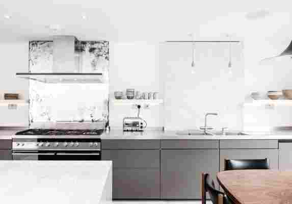
From Houzz , here’s another example of a mirrored backsplash in a modern kitchen. Here, in an interesting twist, the antique finish of the mirror makes it act as a more traditional, textured balancing element to the hyper-minimalism of the rest of the kitchen —especially since the mirror itself is frameless.
If the idea of a mirrored backsplash in the whole kitchen is too intimidating, you can try out the look in a smaller spot (like this wet bar from La Dolce Vita ). This will have the additional benefit of making it look like you have a whole whole lot of alcohol.
In this kitchen from Houzz , the antiqued mirror behind the stove complements the slab of marble behind the sink. I’m not totally sold on the finishing of the mirror, but the design itself I like a lot — and this is another great way to add just a little bit of the mirrored look to your kitchen. Also lead image above.
Here is a kitchen with an unusual backsplash, from Tuis , via Bien . Let’s talk about this for a moment. Usually when I see a photo of an interior, I can decide immediately whether I think it is good or not. (It is kind of my job, after all.) But this… I am not sure. I am firmly on the side of the backsplash mirror, but this feels a little more haphazard. But I could see myself liking it.
What do you think?
