When Matthew explained his split-level plans to his clients, they nodded along and gave the green light. “It turns out that when the project was nearing completion, they hadn’t a clue what I’d been talking about the whole time,” he reveals. Luckily, they were pleased with the innovative results.
In the remodel of a neglected Victorian terrace house in London, MW Architects founding director Matthew Wood had a vision to transform the rundown building into a functional family home. Although the clients were worried that the kitchen was situated half a story below the entrance, Matthew saw this structural detail as an opportunity to create a dynamic split-level space. He opened up the kitchen to the mezzanine floor library above with ceiling voids and balconies.
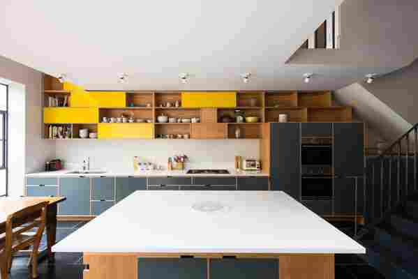
To link the new, airy rooms with one another, Matthew wanted to install cabinetry that would start in the kitchen, climb up through a void in the ceiling, and become shelving in the study. He just needed to find someone to construct it. “It was very clear that it needed to be a bespoke piece of joinery,” he explains. “It wasn’t going to be an off-the-shelf kitchen.”
Conveniently, Matthew attended university with Alan Drumm, the founding director of Uncommon Projects , a custom plywood cabinetry company that was just emerging at the time. The two former classmates immediately agreed on the aesthetic and together designed a bold, elaborate system that ribbons through the home.
Location: This Victorian terrace house sits in an affluent London neighborhood called Belsize Park. It's part of a continuous block of identical homes within the Mansfield Conservation Area, which mandates that rooflines and front façades of buildings remain mostly original. The laws do allow, however, for a bit of creativity when it comes to ground-floor extensions in the back.
The before: “It was horrible,” Matthew says. “It was a damp, wet, miserable hole. It was pretty bad. It was uninhabitable, pretty much. It needed completely stripping out, so we took it all the way back to the brick and made the structural changes.”
The inspiration: The young family who purchased the home wanted raw or natural materials to be expressed wherever possible, and Matthew was completely on board. He worked to find items with longevity and lasting richness.
Square footage : 30 square meters (about 323 square feet)
Budget: “I think we budgeted £20,000 (about $25,750) for the joinery, but it was an estimate before it was designed,” says Matthew.
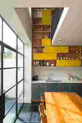
"It was definitely the big feature element,” Matthew says of the cabinetry.
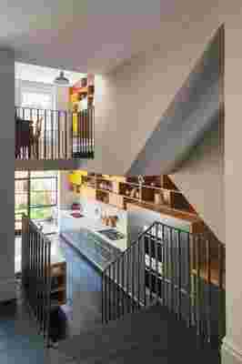
Cabinetry with sliding doors moves up through a void in the ceiling.
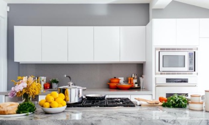
Cabinetry: Uncommon Projects Custom Birch Plywood Cabinets Veneered in American White Oak. “We didn’t want a white kitchen,” Matthew says. “We wanted something with some color. The yellow and the gray go very well with the oak, so that was an easy match. As the joinery goes up through the void and into the library above, the shade of the yellow deepens and it actually becomes a red by the top.”
