Julie explains that she found this one-bedroom apartment last spring on StreetEasy “when everybody was moving out of NYC to, like, I don’t know. Long Island? ‘Oooh, New York is over!’ Well, hope you like cooking!” Julie shares her home with a gorgeous cat, Jimmy Jazz, along with some enviable appliances. “I have a corner unit on a high floor with a washer-dryer. The only things I have to complain about are absolutely everything else going on in the world,” she admits. “I pass time in my apartment doing anything you can think of, except for getting sunshine and fresh air. I’m blessed to be an indoorsy person during quarantine, and to be able to work from home, for the time being, is a dream.”
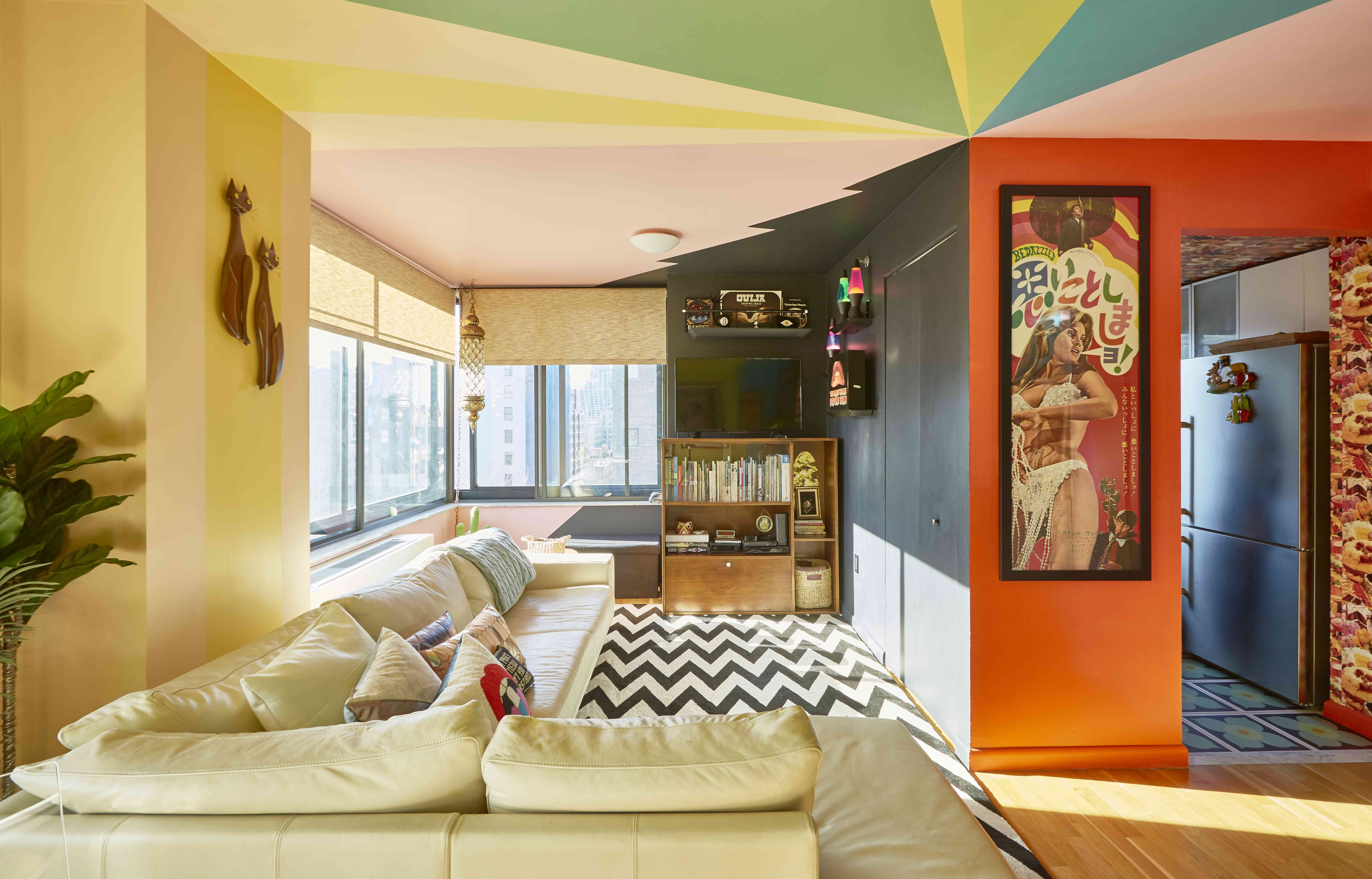
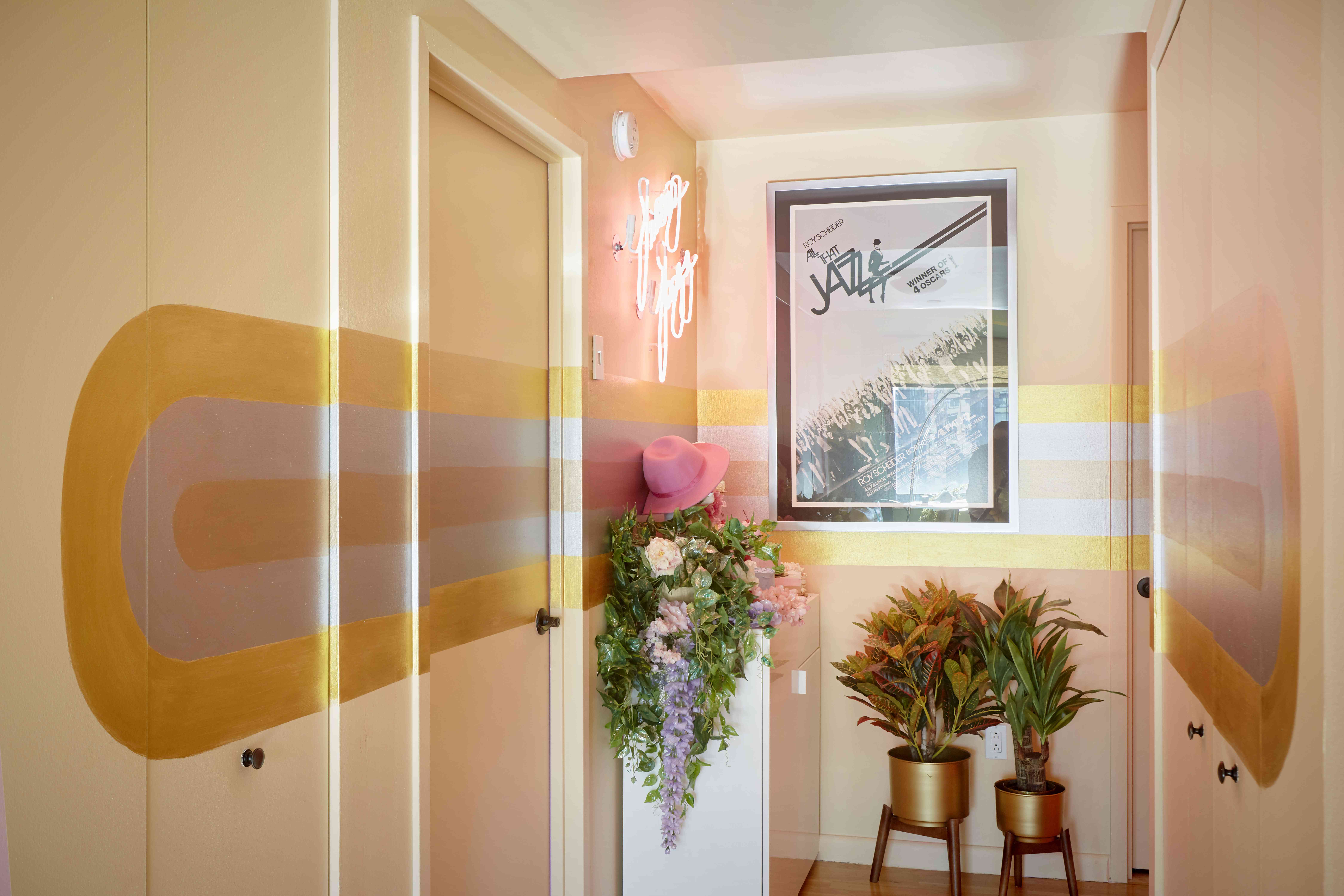
Her 750-square-foot rental is vibrant, interesting, and funny, and features a neon sign, stripes, and fake cakes and flowers in the entryway, wild paint colors in the living room, dessert-themed wallpaper in the kitchen, and more. Julie collaborated with her friend, painter and decorator Steven Hammel , to create this one-of-a-kind space, but Julie isn’t afraid to get her hands glittery. “I painted all of my lava lamps; I made that magic eight ball out of papier-mâché, I figured out how to assemble fake potted plants with stuff you can get at Michael’s and air-dried clay and acrylic paint,” she writes. “I put iridescent glitter mod podge on everything.”
Apartment Therapy Survey:
My Style: Obviously, this is a very groovy apartment, but I’m going to use the adjective “cult” to describe my aesthetic. Because even before I knew what the word meant, I knew when I was growing up that if you saw the adjective “cult” in front of something, you knew it was going to be cool. And maybe a little scary or funny or strange, but always different. Like, I knew “Pink Flamingos” was a cult movie. I knew all of my favorite TV shows were “cult” (this is before I knew that “cult” could also be a synonym for “low-rated,” but whatever). And I’ve always been excited to read about the goings on of an actual cult! That said, Keith Raniere is never allowed to darken my apartment’s doorway.
I know that there’s a lot of wit and theatricality in my space, but it’s also important to me that there’s an intersection of cool and fun in every spot your eye lands. I don’t want anything goofy in my place without juxtaposing it with some edge, and vice versa.
Inspiration: First and foremost, my collaborator and friend Steven Hammel , who is the most brilliant artist I know. He painted the whole apartment: he’s a decorative painter and interior decorator , and he and I made and continue to make every decision about this space together. He’s so inspiring to my creative life, even beyond the apartment. He encourages me to try things I never thought I could do (like collage my own wallpaper or paint things that don’t match my vision instead of killing myself looking online for an acceptable alternative) and we balance out each others’ propensity to push for more . We’re constantly roping each other in when the other one wants to go too big, although in the case of this apartment (he and I did a lot of reincarnations of my old place), I’m usually the one who’s pushing for a more “out-there” idea and he’s the one saying “Julie, enough.” And whenever he says, “This might be too crazy, but…” I know I’m about to get the gift of an idea I absolutely love. He’s like my writing partner for the project that is my living space. I completely adore him.
Steven and I went into this space asking how we could incorporate a lot of color and open up the space so it didn’t feel cluttered or confined. We constantly managed the balance between maximalism and modernism while we made sure every spot your eye lands on has its own identity but also acts as a transition, so the place has flow and each corner connects to what it’s about to be. Neither of us obsess on era. I love vintage things, obviously, but I like to combine styles so nothing’s predictable.
The first thing Steven figured out when I signed the lease on the place was the rainbow stripes on the ceiling that would meet in the corner that united the kitchen with the living room and dining area. The stripes bleed down to the walls and make a perpendicular layout seem sort of like a round… I want to say arena shape? I wish I’d taken architecture in college, I would know more words. Anyway, I wanted a lot of color and he figured out a way to make the place feel integrated and airy and also connect in a really clever and exciting way in that ceiling corner, which is both brilliant and the central grounding concept of the whole apartment.
As far as concrete examples of inspiration, I think “fake-real” is a big thing for me. I love fake plants and fake cakes and fake wood finish. It’s a way of including the organic elements of the movies I love that took place in Manhattan in the 1970s — hanging spider plants and macramé and hardwood floors and silver lighting fixtures and bra-less women — with the artificiality of surface pleasures, like glitter and mirrors and other kinds of New Wave talismans of ‘80s glamour, which I grew up thinking were the epitome of feminine adulthood. I love department stores from that era and there are hat-tips everywhere to, say, the scene from Bloomingdales in “Splash” as well as the visual displays in the cinematic classic, “Mannequin.” Both very formative influences!
I also love the movie “After Hours,” and a lot of the ’80s Memphis group aesthetic means “sexy downtown Manhattan” to me. For my bedroom, we found this very exciting purple-pink that almost has an iridescent quality for the walls, and accessorized it with Nagel prints and Steven painted this black and silver gorgeous zebra print, which acts as a little alcove/ headboard to make that side of the room a little cozy. I love zebra print without a white background: it always reminds me of John Waters.
Favorite Element: The view. Natural sunlight is very important for my mood management, and if a day passes where I happen to not leave the apartment for coffee or whatever, I’m always aware of what time of day it is from the light.
Biggest Challenge: Probably figuring out a way for the bathroom — which is smaller and greyer than my last place — to be warmer and more welcoming. And just balancing out color and pattern with space and flow. There’s a certain amount of rule-breaking Steven and I do that works. Like, they say, for a small space, that you shouldn’t do too much color or pattern. But we leaned into the busy-ness and it’s cozy! And nobody thinks my kitchen is smaller than it actually is just because there’s this wild wallpaper everywhere.
Proudest DIY: I have a lot, because pretty much everything in the apartment is a triumph of smart thrifting and the initiative to put on one’s smock and go back to art school. I painted all of my lava lamps; I made that magic eight ball out of papier-mâché, I figured out how to assemble fake potted plants with stuff you can get at Michael’s and air-dried clay and acrylic paint. I put iridescent glitter mod podge on everything. I guess my proudest are both cake-related: the tableau when you first come in and the wallpaper. Oh — and the mural behind the vintage table lamp is something I made out of pages I scanned from a book called Color Me Beautiful, which tells you what colors to wear based on what season you are. I am a spring, FYI.
Biggest Indulgence: When I first moved in, I found a Japanese movie poster on eBay for one of my favorite movies, Bedazzled , starring Peter Cook, Dudley Moore, and Raquel Welch. I kept telling myself “foreign movie posters are pretentious” and “I’m not the kind of person who has foreign movie posters” but I was just lying to myself because I wanted it so badly. I broke down and bought it. Of things I regret, it doesn’t even make the top thousand.
Is there something unique about your home or the way you use it? I think besides groovy and cool, unique would be in the first few words you’d think of to describe it.
Please describe any helpful, inspiring, brilliant, or just plain useful small space maximizing and/or organizing tips you have: Surround yourself with people who inspire you and don’t be intimidated by anything art-related. You don’t need fancy or expensive art supplies — just use what works. Crayola makes some beautiful non-toxic stuff, and that shit always washes off if you don’t like the mess you made. I think adulthood is a way of actualizing fantasies you’ve had since you were little, because who’s stopping you now? Put glitter on everything! Paint the walls black!
Finally, what’s your absolute best home secret or decorating advice? Always check eBay and Etsy before buying something from Amazon or a corporate chain. There are independent artists everywhere who make unique stuff or have marvelous taste in curation, and it’s easier than ever to patronize them online. And don’t be boring! Unless you’re boring. Then, be boring!
Resources
PAINT & COLORS
All paint is Benjamin Moore. The rainbow.
Wallpaper is custom, via Spoonflower , and Etsy, in the bathroom.
ENTRY
Bar — CB2
Fake cakes — eBay
Silk flowers — Michael’s and Jamali on 27th street, with glitter paint and mod podge from Blick
Custom Neon sign — Name Glo . Jimmy Jazz is my cat’s name and he’s so handsome, he deserves his name in lights. I wanted it to look like the opening title card of the movie Brazil.
Key shelf is from Lowe’s — Steven painted it gold.
Plants — Jamali , and planters from Etsy
Mannequin head — eBay
Mirror — Seletti
Sunglasses case — Urban Outfitters
LIVING ROOM
Sectional Sofa — BoConcept
Cushions — Wayfair , various (search for“vegan leather”) and Jonathan Adler needlepoint
End Table — CB2
Rug — Wayfair
Hutch — Vintage (My grandmother’s)
Shelves— Custom, Sagenworks (Becky rules) and West Elm
DINING ROOM
Dining table — CB2
Fake plants — Jamali , Michael’s
Wall art and plant hanger — eBay and Etsy
Bookshelves — The Container Store
Sliding coffee table — Wayfair
Nightstand I use as a printer stand — CB2
Vintage telephone table — My dad’s
Bookcase — Vintage (my dad’s)
Floor lamp — CB2
File cabinets — AI Friedman
Chairs — CB2
All posters — eBay
KITCHEN
Wallpaper — Spoonflower
Tiles are white — I put stickers on them from Mirth Studio
Magnets are from eBay — Those are wall art I made into magnets with a hot glue gun
BEDROOM
Bed — West Elm
Dressers — CB2
Lamps — eBay
Tables — eBay
Jewelry display — The Container Store
BATHROOM
Rug and Shower Curtain — Society6 (I painted over both with fabric paint and acrylics and glitter.)
Leopard Rug — Wayfair
Everything on the walls is eBay
Wallpaper — Etsy
Thank you Julie and Jimmy Jazz!!
This house tour’s responses were edited for length and clarity.
Share Your Style: House Tour & House Call Submission Form
See More: ⇒ Recent House Tours ⇒ House Tours on Pinterest
